I've finished reviewing the 1st Developer course (K10) last week and now I'm into the 2nd one.
And yesterday, I learned about Device Profile which is part of the optimizing websites for mobile devices topic. (not discussed in K11 dev course)
It is also something that I always see when using the Preview option and it's good to know more about this adaptive design approach in Kentico.
 |
| Device Profile |
To set-up a new profile, just go to Development applications -> Device Profile and supply the necessary fields or add a macro rule like current device max screen size should be between 0 and 768 pixels (width).
 |
| Add New Device Profile |
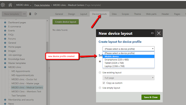
To use this profile, you will need to make use of the Device lay-outs found in the Page Templates. (so that's what this tab is all about?)
 |
| Use Device Lay-out |
Then select to copy the default device profile and just edit it later (for how the lay-out will be)
Then go to the Pages application and select the page where you want the changes will be when viewing different devices. Like if you do not want the menu to be showing in the device profile you created (mobile device). You can adjust the CSS list menu web part and add a macro rule.
 |
| Using Macros for Web Parts |
If you want to learn more about this feature, you can check-out Kentico's documentation about Developing websites for mobile devices.
On another note, the lay-out mapping found in the Device Profiles looks interesting also. Hmmnn..


No comments:
Post a Comment